Case study — Polar
Next-gen UI for Polar's smartwatches
A design sprint that gave Polar's smartwatches a new operating logic, not just a new look.
Context & role
The inventor of the category, behind on usability
Polar invented the wearable heart rate monitor in 1982 with the first wire-free Sport Tester. By 2016 competition had left Polar behind on everyday usability despite its deeper sports-data expertise. Polar was planning its first color-display smartwatch and brought in Reaktor to help design the experience.
I did the hands-on UI design — typography, iconography, color, the watchfaces, and dashboards — working alongside a UX designer who led the interaction structure.
The opportunity
Best-in-class data, hidden in hierarchy
On a screen this small, showing the right thing mattered more than showing everything: the opportunity was to lead on contextual insight, not just precision measurement. Polar had the best data in the industry, but it was often hidden in hierarchy or hard to parse. To make Polar watches relevant they had to be designed for 24/7 wear, not just sports use as before. The real differentiator, however, was the quality of personalised insights Polar was able to deliver to the user based on their data. Polar had a history of real innovation and interpretation of data, giving it an edge over competition.
User experience
Key experiences
The user experience we designed for Polar centered on five different key experiences.
Smart Highlights
Glanceable watchface overviews of the user's most important data points.
My Status Feed
Relevant & timely status feed accessible right from the watchface.
Sport Dashboards
Overview dashboards of the user's key sports are a swipe away.
Easy Navigation
Navigation allows for broad access and extendability.
Touch & Physical in Sync
Similar controls mapped to similar functions.
From structure to screen
A three-tier hierarchy built for a few square centimeters
The interaction structure we devised leveraged our opportunity and led with insight. We organized every screen into three tiers, allowing the user to intuitively determine the level of detail they were looking for.

Tier 1 — Glanceable insights
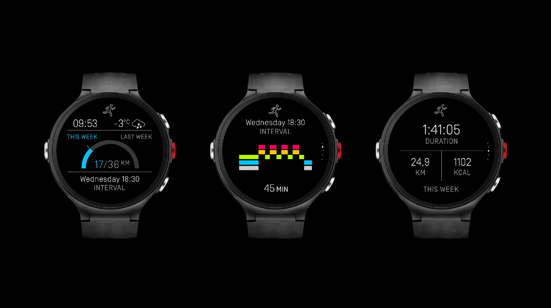
The day's headline stats. 1-3 tappable data mappings per watchface.

Tier 2 — Glanceable overview
Context views to headline stats, supporting main and sport watchfaces.

Tier 3 — Glanceable detail
Everything a deeper look needs, visualised for glanceability.
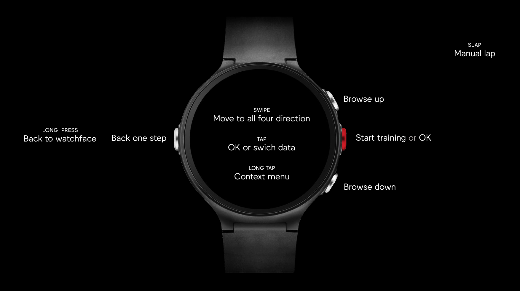
We mapped physical controls to match our UX hierarchy, allowing the user to easily dive deeper into data and back again. Long press was our Home button, always returning the user to the watchface.
The visual design system
The visual language
The visual identity I defined for Polar leveraged Polar's brand attributes, applying them to the watch UI in a recognisable but novel way.
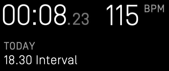
Typography for legibility
Simplon, slightly condensed to save screen space while staying legible at small sizes.
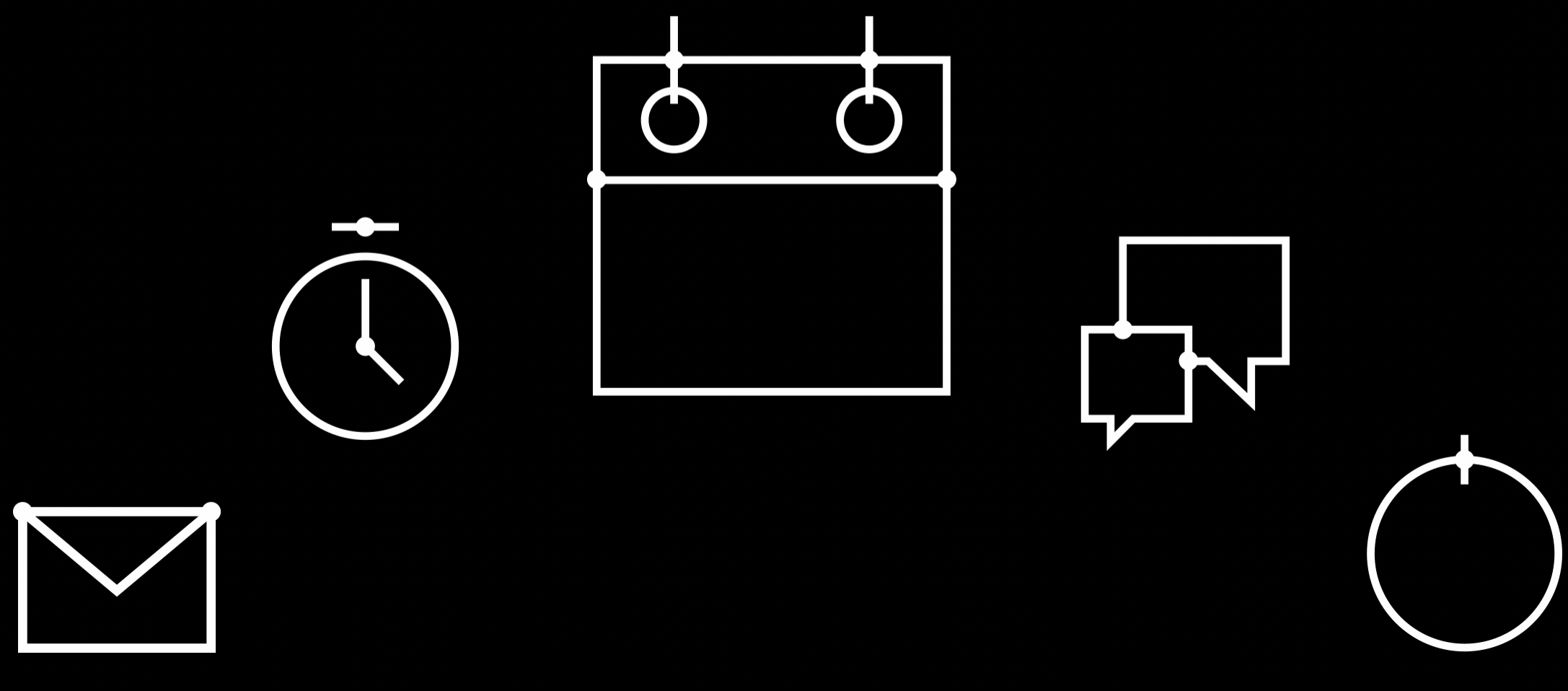
Precision pictograms
A hairline icon system built from precise, sharp shapes.
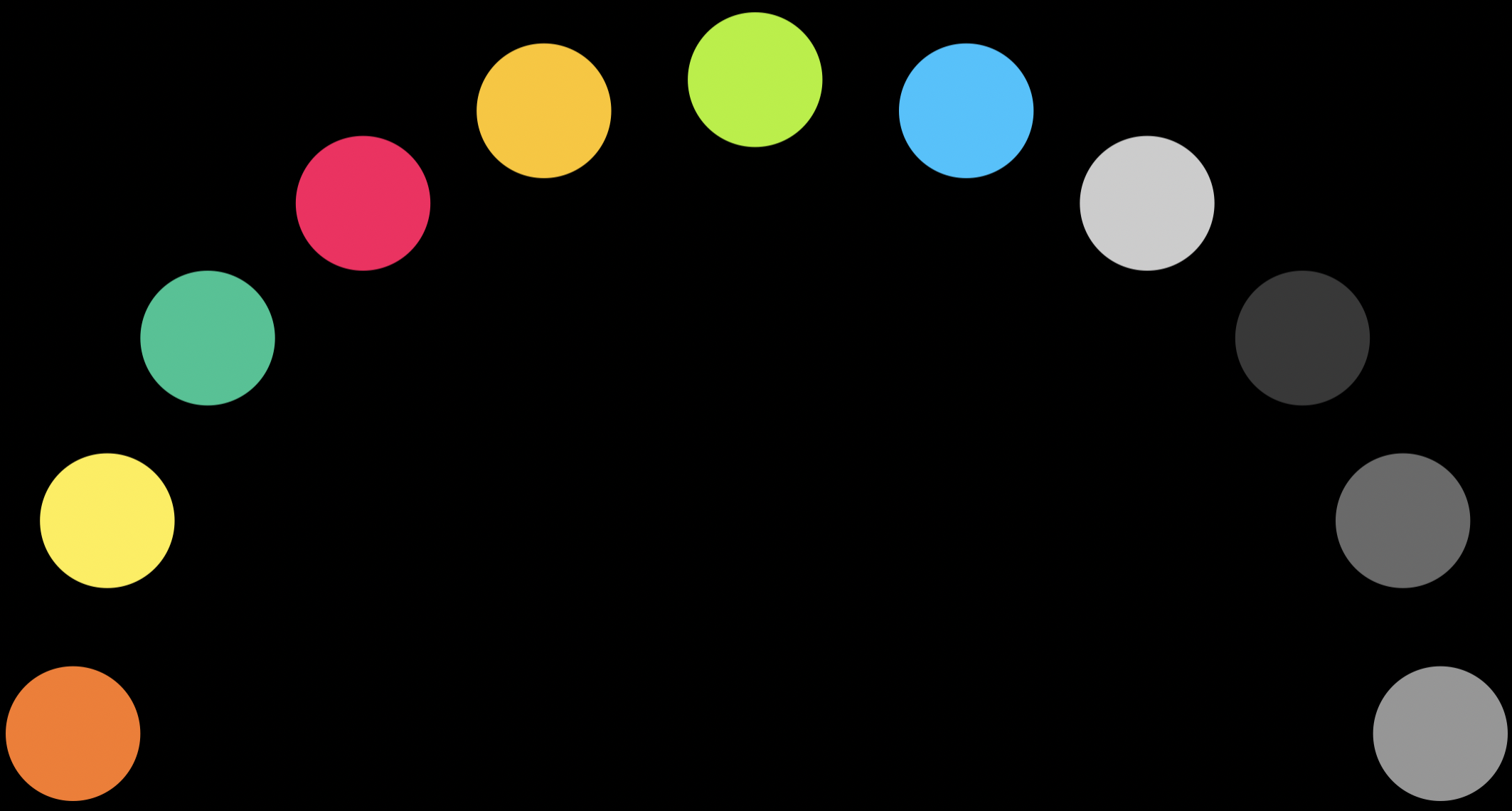
Color for data meaning
Every color mapped to a specific data role, not decoration.
The Band ties it together
A dynamic arc reused across every watchface and dashboard, tying the system into one language.
Watchfaces & dashboards
The system, applied
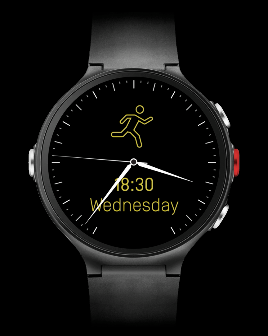
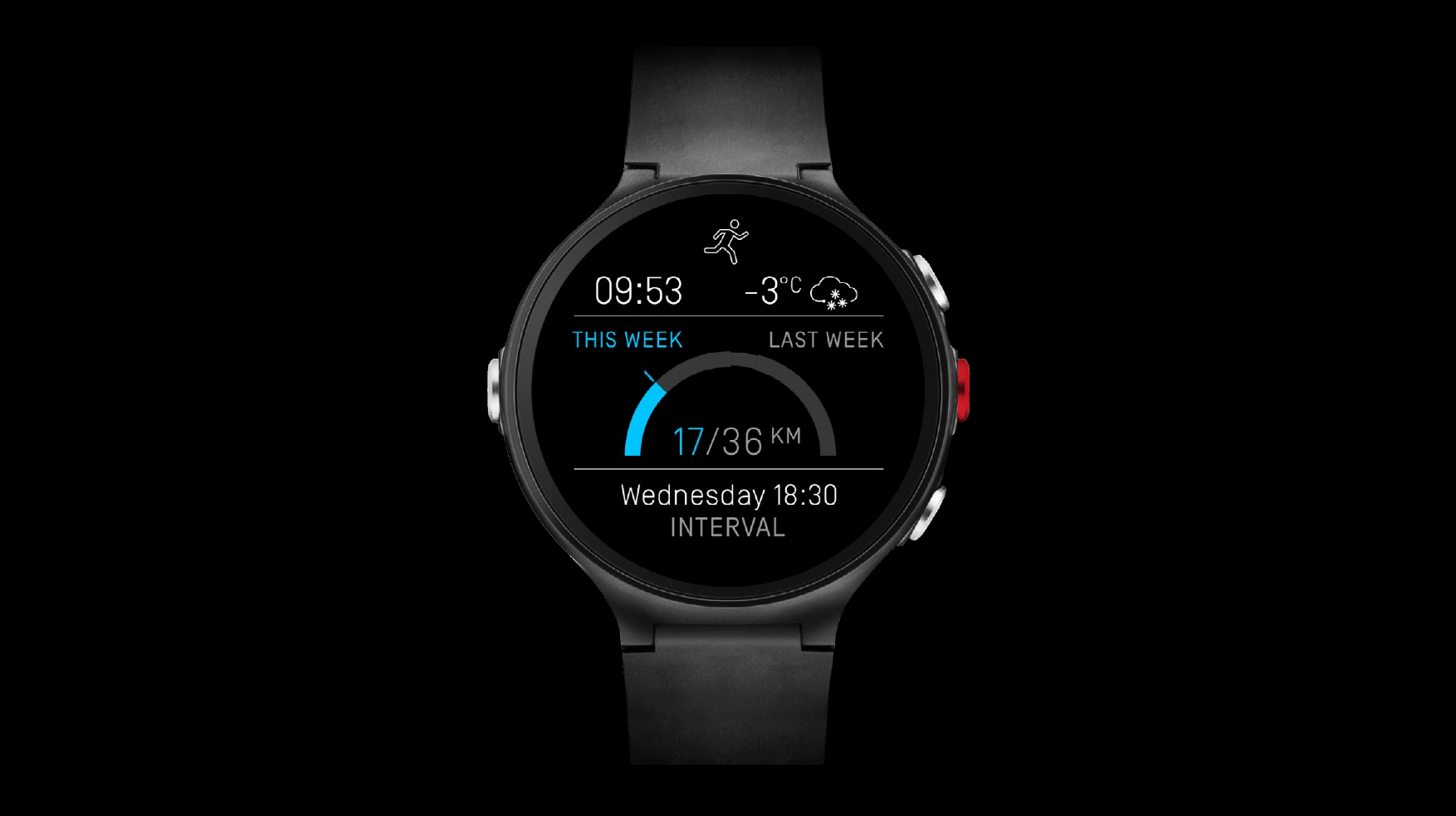
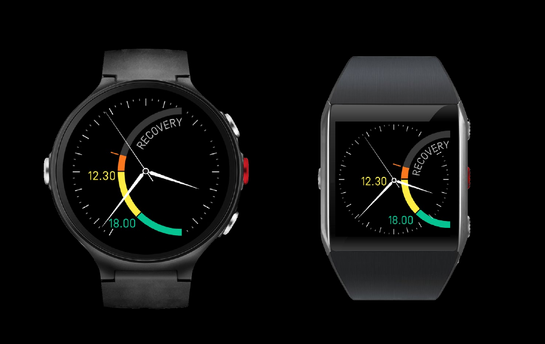
The watchface family ran from a plain default through Recovery, Activity, and an interval-focused running face — one visual language, reused for different data. Customisation worked the same way: users picked what mattered, inside good defaults, not decorative skins. Sport Dashes and a three-state Running Dash carried the system into training itself.
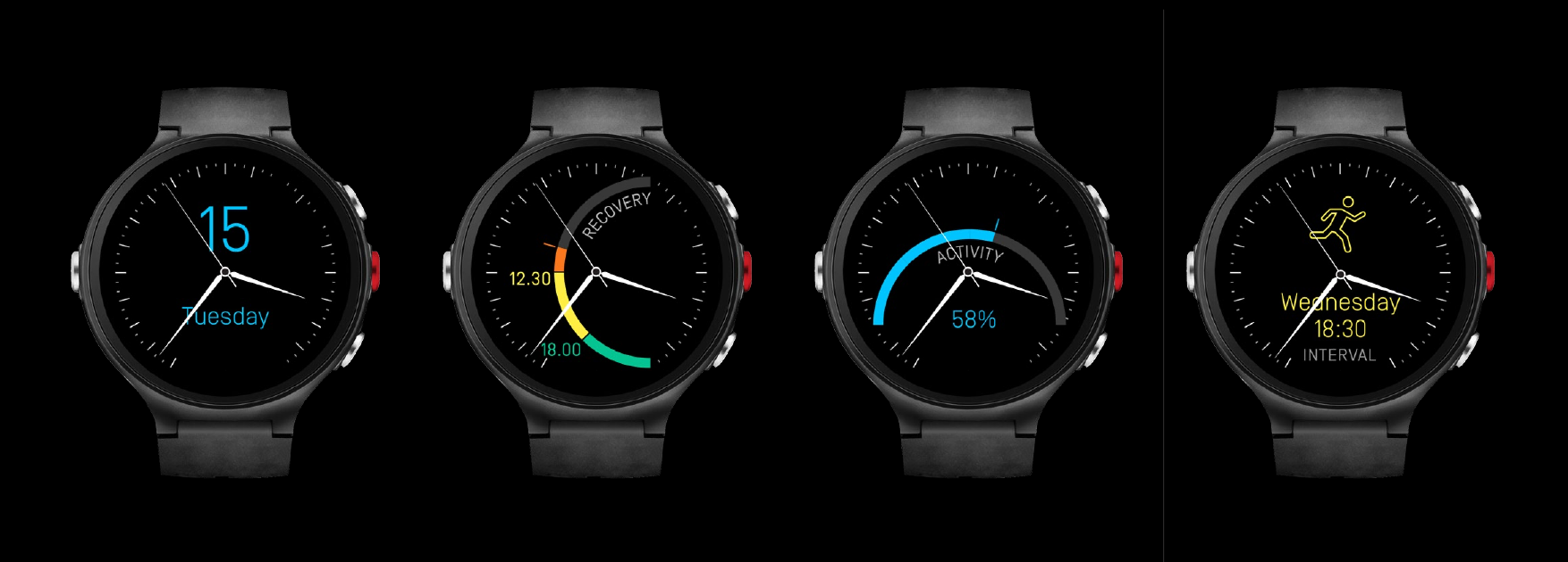
Watchfaces. Four different data stories.
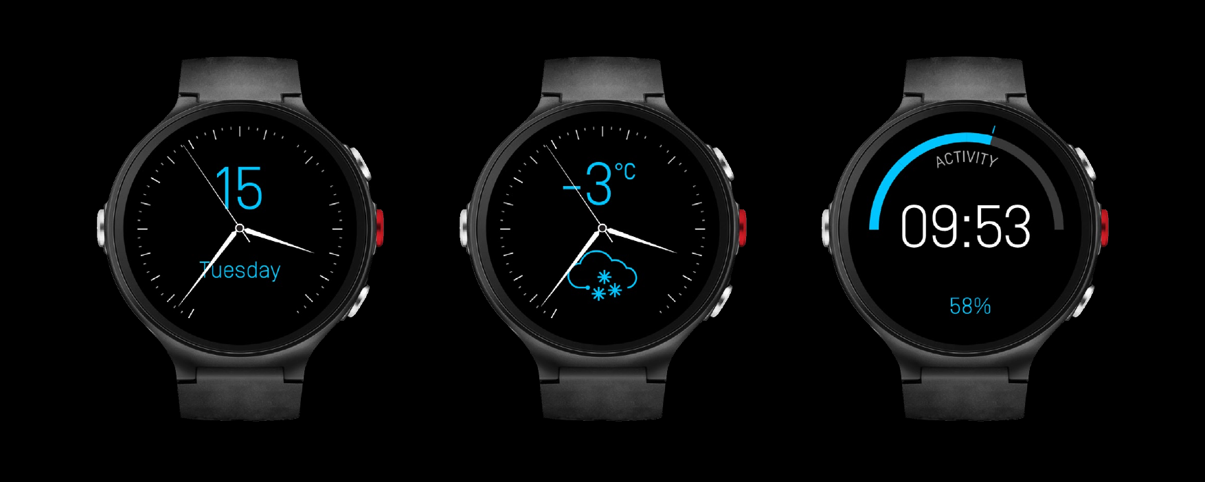
Watchface customisation. Users choose what matters, inside good defaults.
Designing across form factors
Proposing round — a first for Polar
Polar's watches had always been square in shape. As part of our drive to modernise the watch we proposed round as the new form for this generation. Round fit our 24/7 wearability paradigm, placing the new generation in the realm of watches instead of sports trackers.
Reflection
Hierarchy isn't a nice-to-have, it's the job
Designing for a screen worn 24/7 changes what "good UI" means — hierarchy isn't a nice-to-have, it's the whole job. This was a design sprint, not a shipped product, but proposing round for a company that had only ever shipped square demanded the same rigor a production system would: a visual language precise enough to hold up on a form Polar had never tried before.